
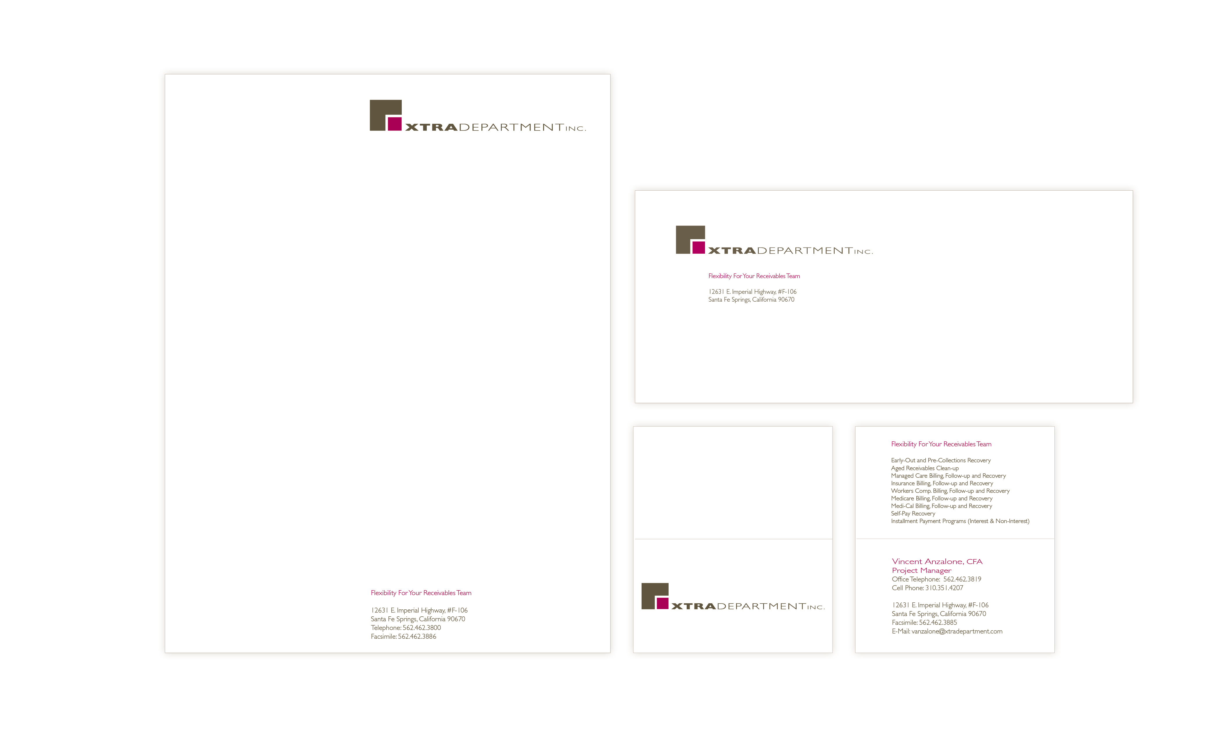
Xtra Department Identity Design
This logo was designed to communicate that Xtra Department integrated into your hospital or medical office billing department seamlessly as a collections and payment management service.

Something Blue Identity
This identity was created for a bridal jewelry designer, and the feel of the identity was to be romantic and incorporate blue into the design.
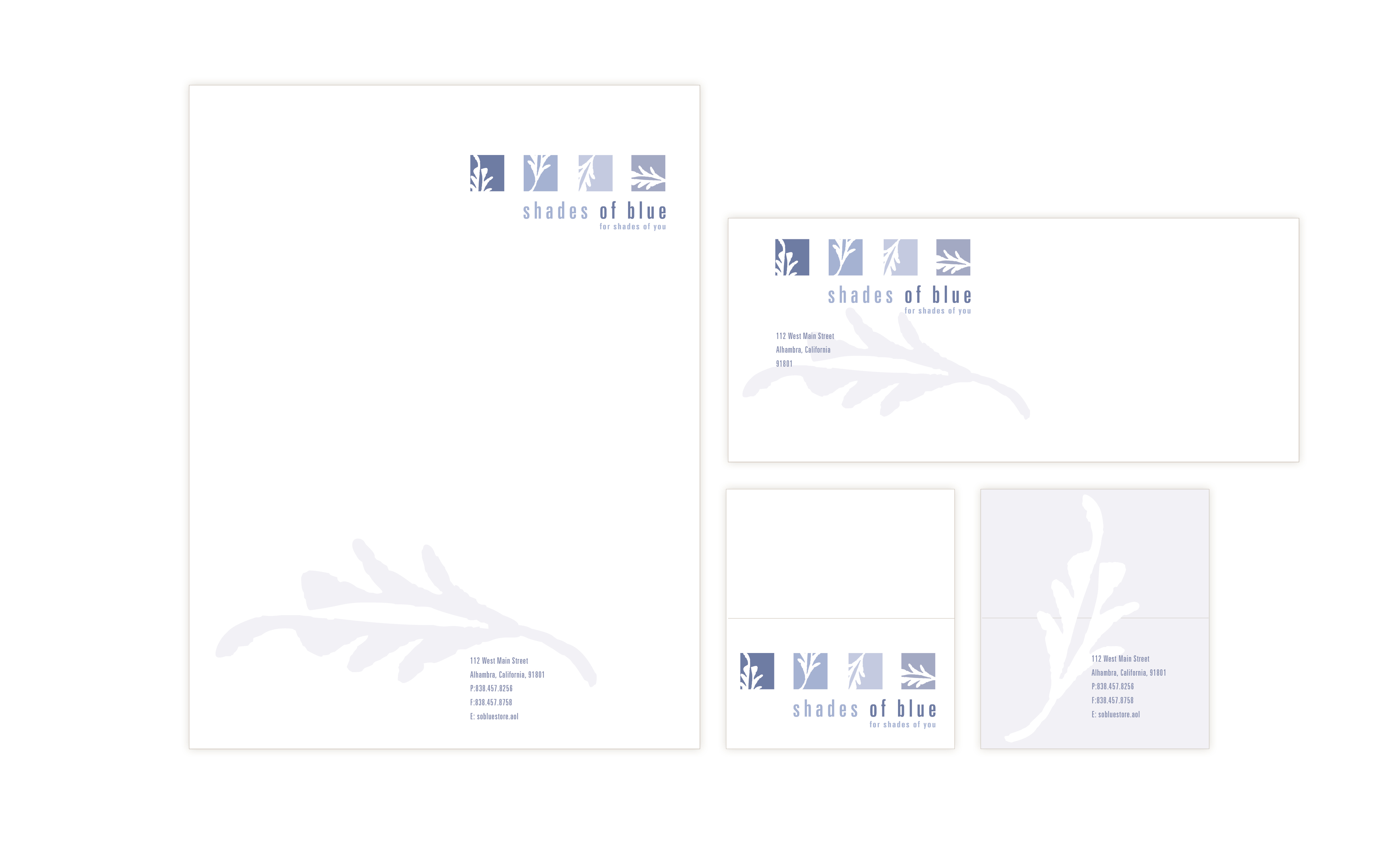
Shades of Blue Identity
This identity was designed for a bath and gift boutique that wanted to promote a calm and fresh atmosphere for the shop and its customers.
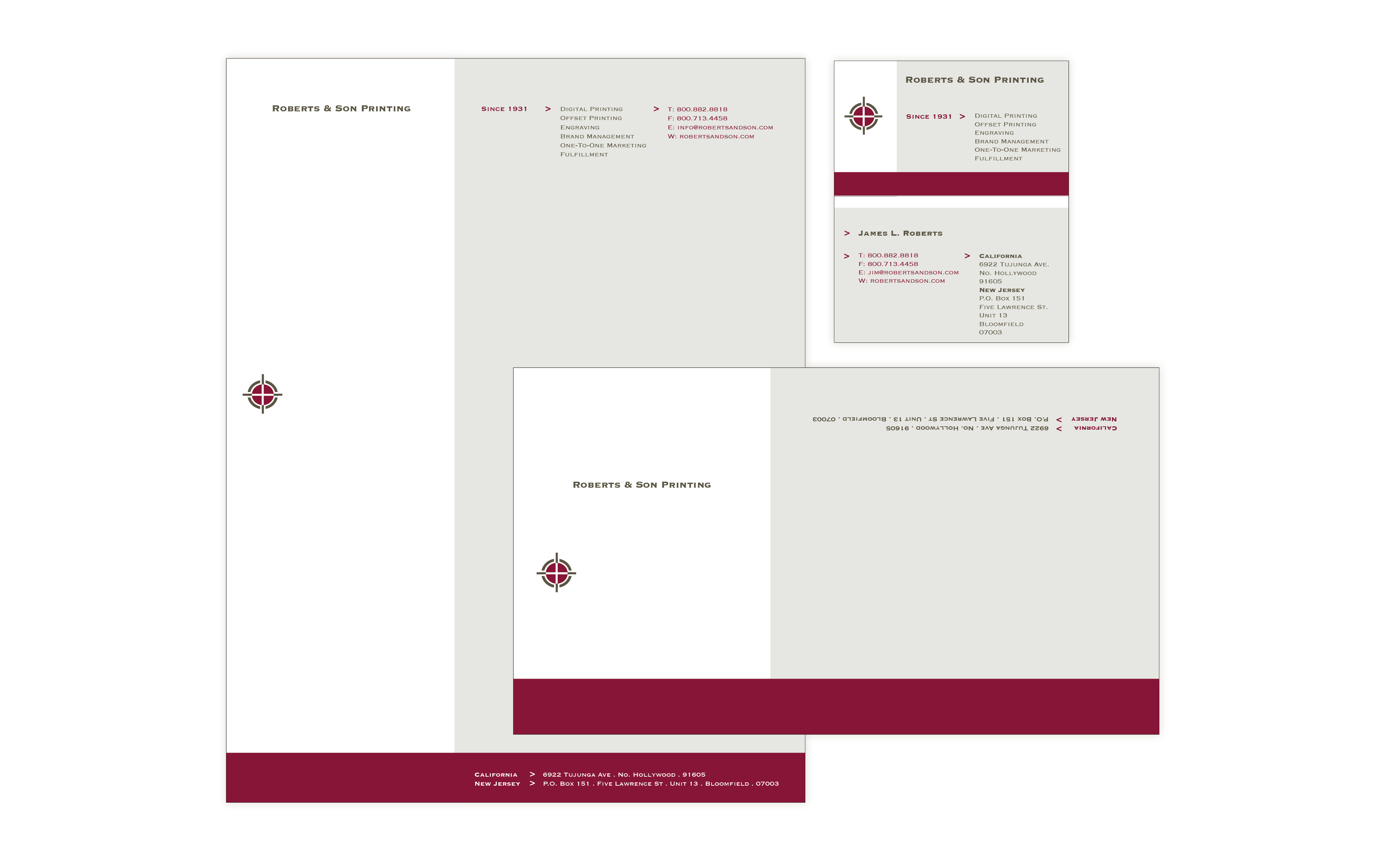
Roberts & Son Printing Identity
This identity for a print shop was designed to show precision and creativity through the stylized registration mark.
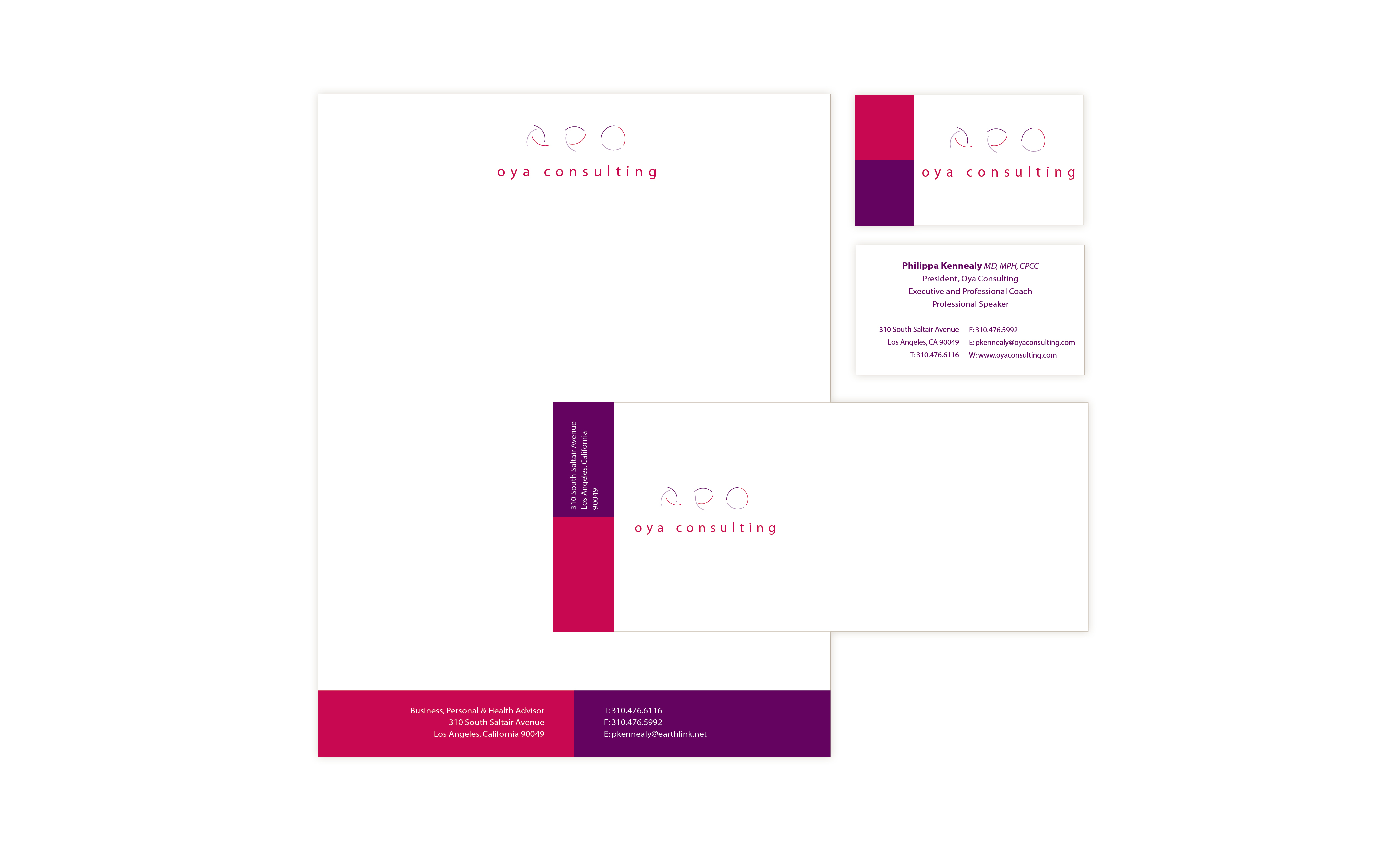
Oya Consulting Identity
This identity is for a personal coach and was named for Oya, the African Goddess of Change. The coach’s philosophy was that all of us has the capacity for optimizing, that through the coaching process, the parts come together and harmonize into a complete whole.
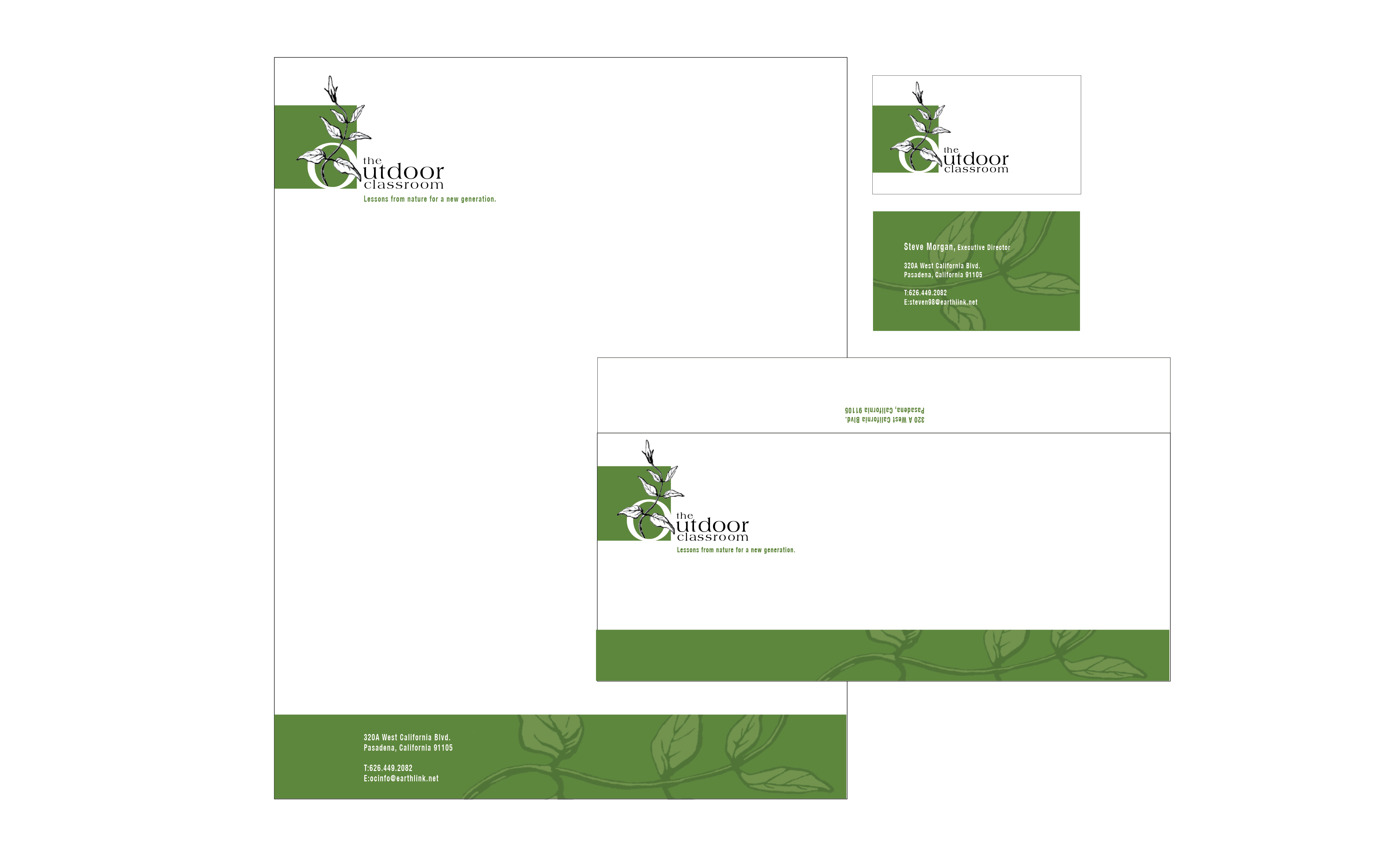
The Outdoor Classroom Identity
This identity was designed for a program that takes inner-city kids into the garden and teaches them the power of nature through gardening lessons and harvest.
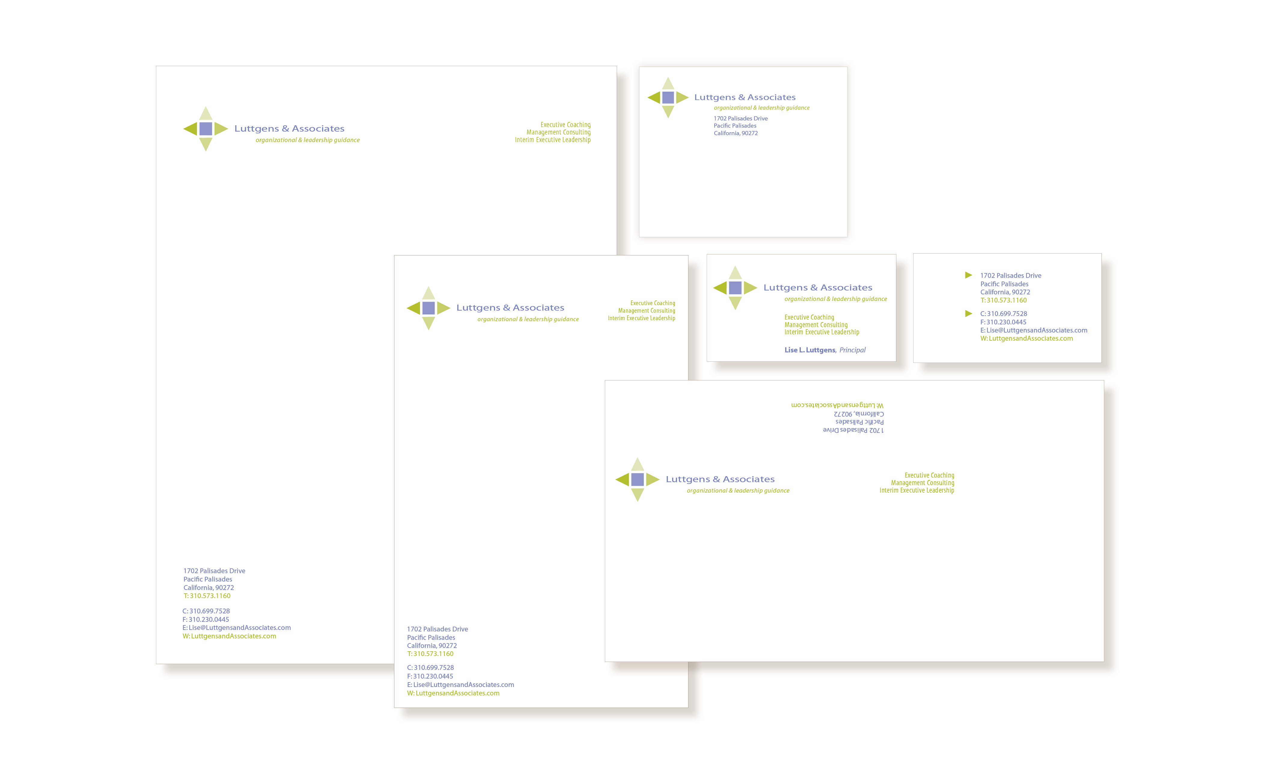
Luttgens & Associates Identity
This identity is for a corporate coaching and consulting business who works with executives and management to increase their leadership effectiveness.
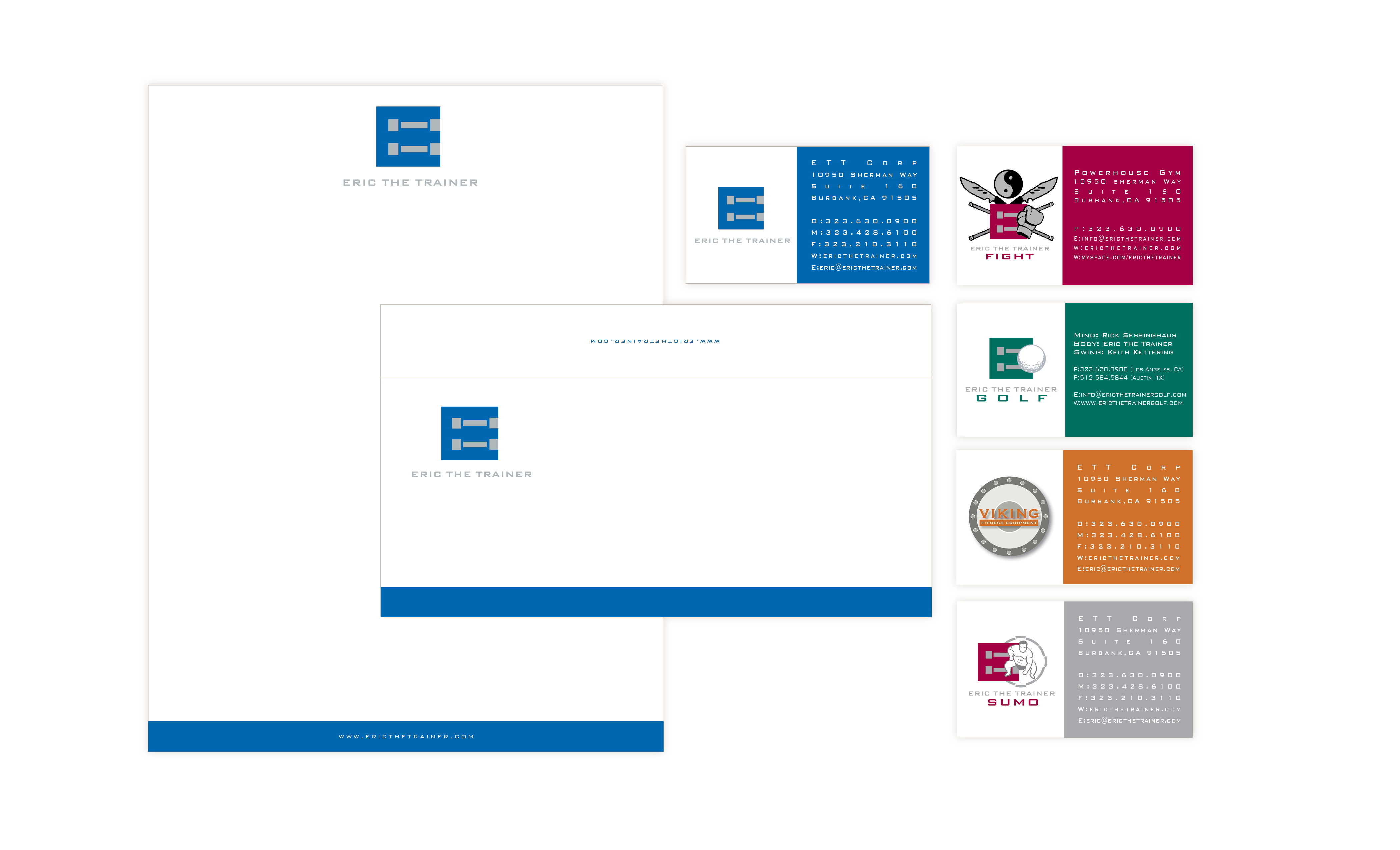
Eric The Trainer Identity
This identity was designed for a personal trainer who has also developed a unique set of fitness programs under the Eric the Trainer umbrella: ETT Fight, ETT Golf, ETT Viking and ETT Viking. All the programs have to work under the original identity but still have their unique visual presence.
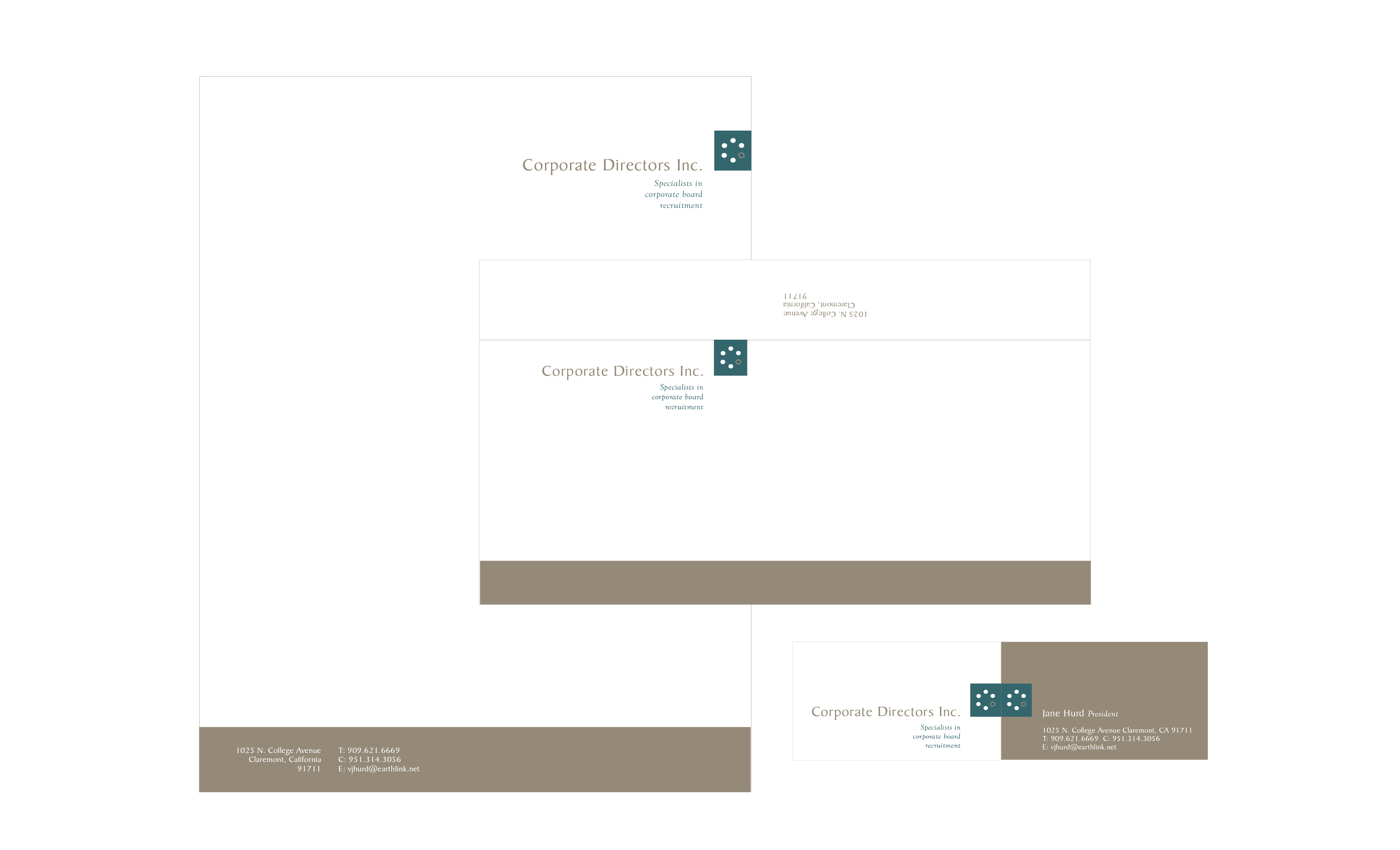
Corporate Directors Inc. Identity
This identity was designed for a corporate board recruitment company and the logo shows that the missing seat to the corporate board being filled.

Crown City Hardware 90th Anniversary Identity
An updated identity to celebrate the 90th anniversary for a restoration hardware company. The slogan is “Get Lost in the Details” to promote the attention to detail that beautiful hardware can provide.
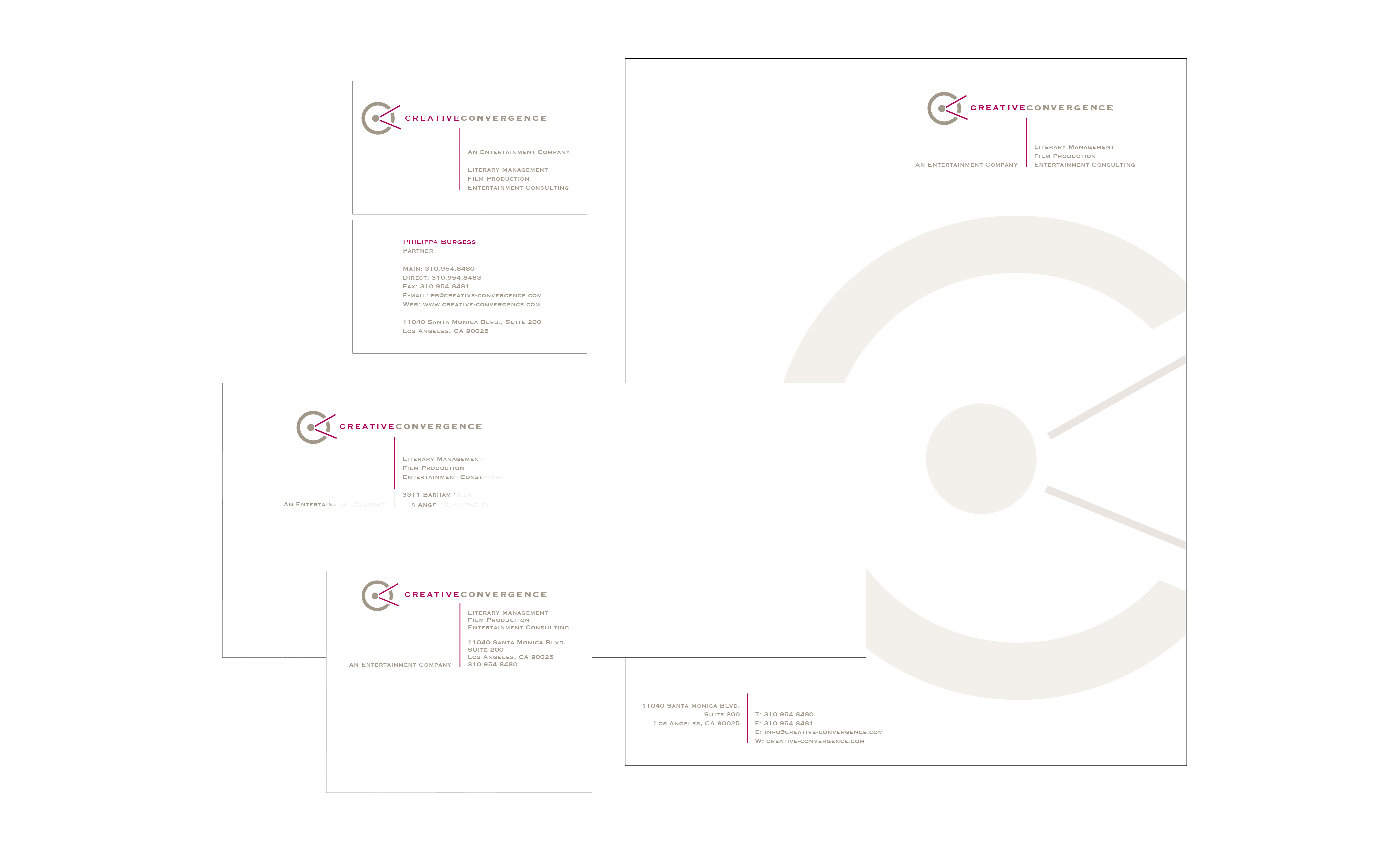
Creative Convergence Identity
This identity was designed to communicate the idea of a convergence of talents in the literary and film development services of this company and to play with the letter “C” in the name. There is also a subtle secondary film projection icon to reference the film industry.
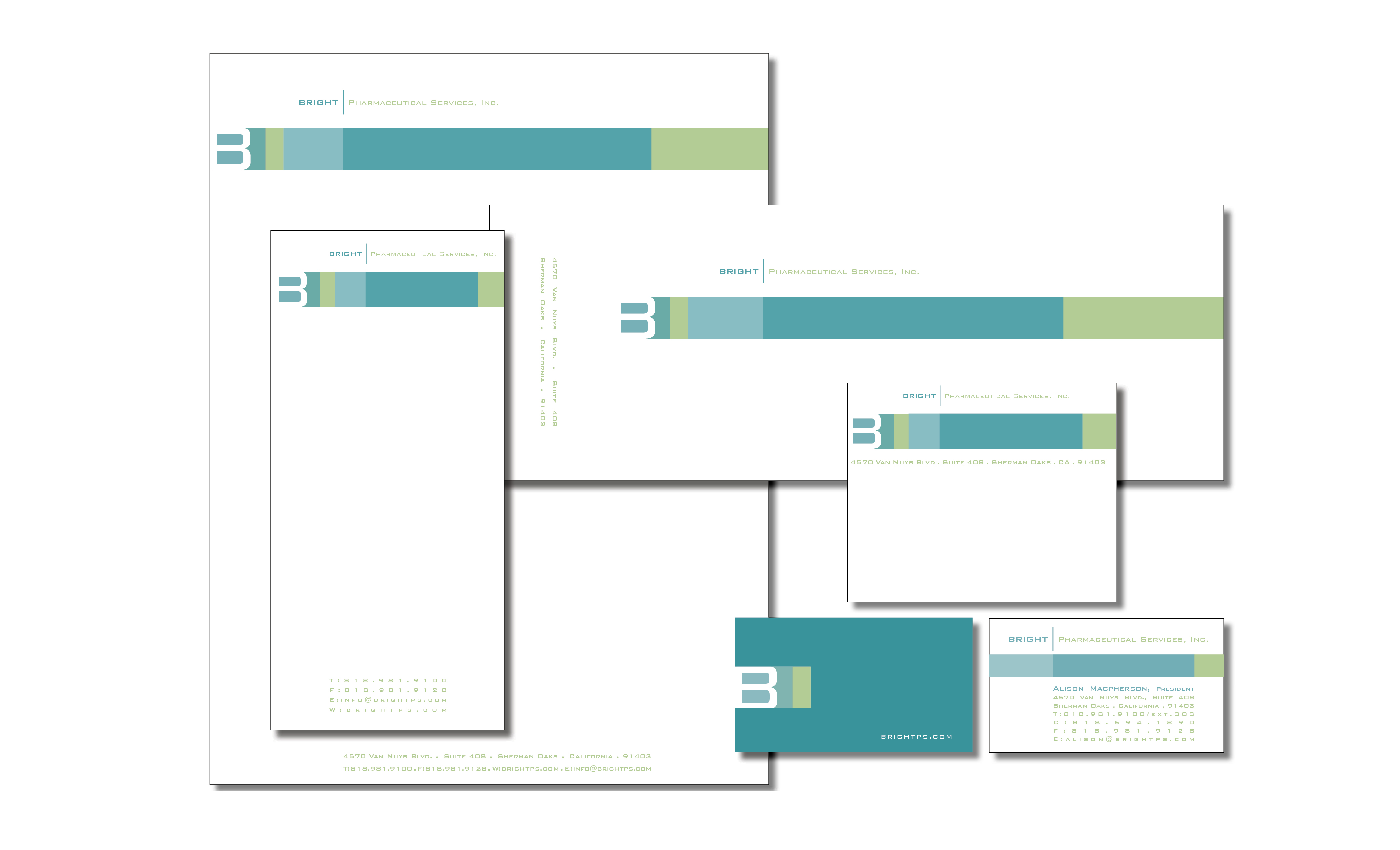
Bright Pharmaceutical Services Identity
This identity was designed to show a clean, crisp, technical yet creative look for this clinical trials company.
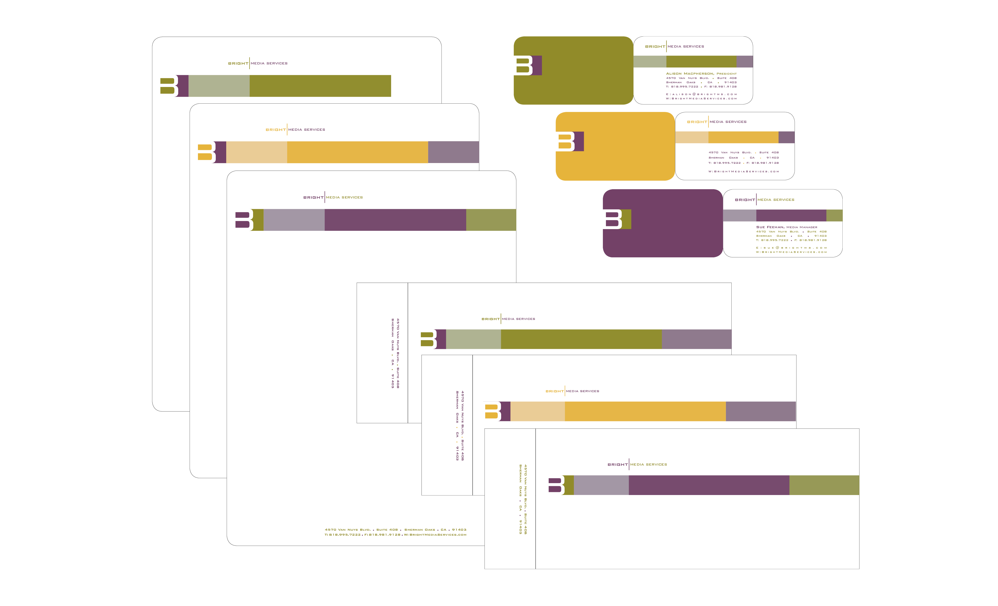
Bright Media Services Identity
This is the sister company to Bright Pharmaceutical Services, so the ID was to companion, but through color, show the creative side to this media placement company.
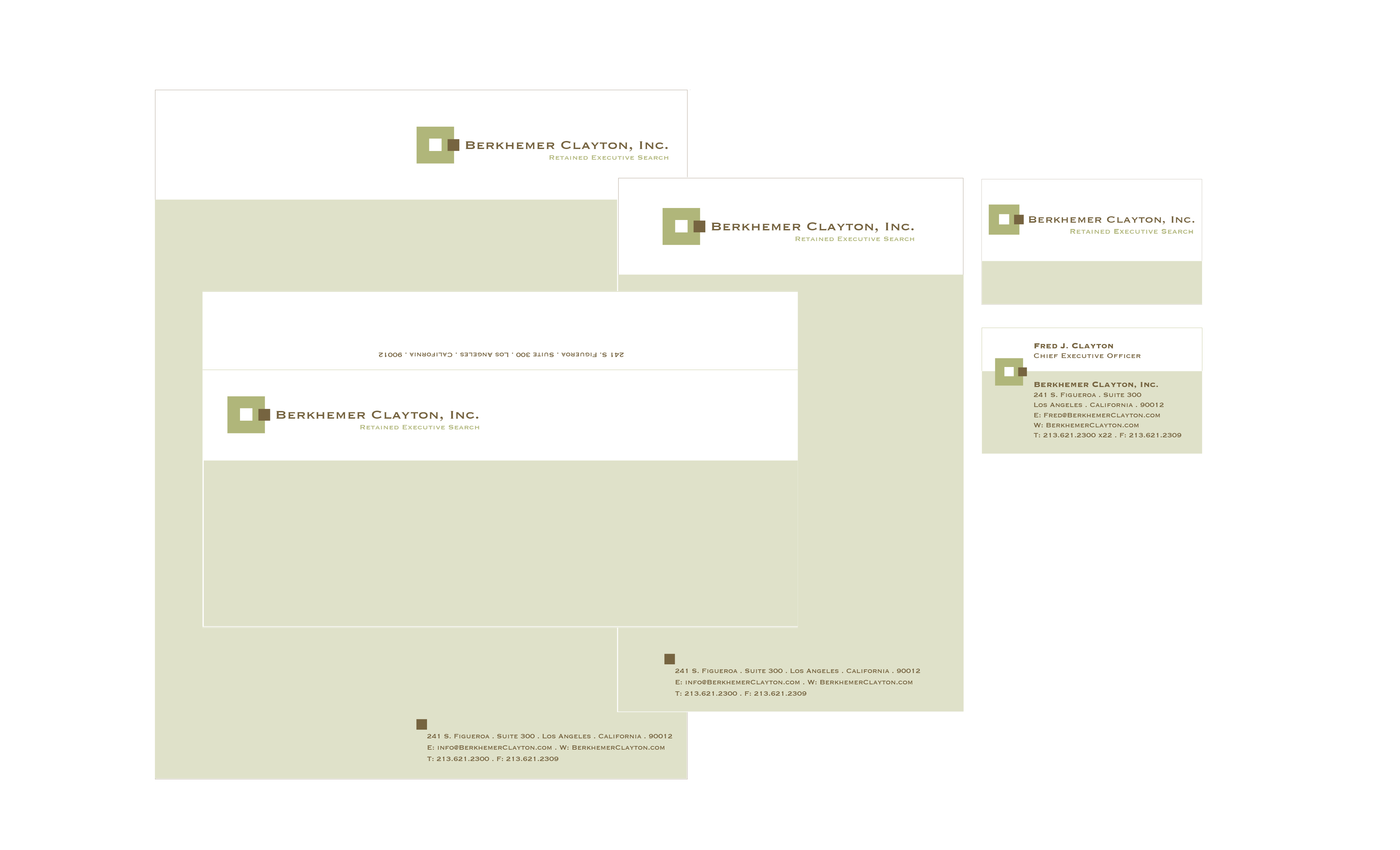
Berkhemer Clayton Inc. Identity
This identity was designed to show the perfect fit that this executive search company will find for its clients.
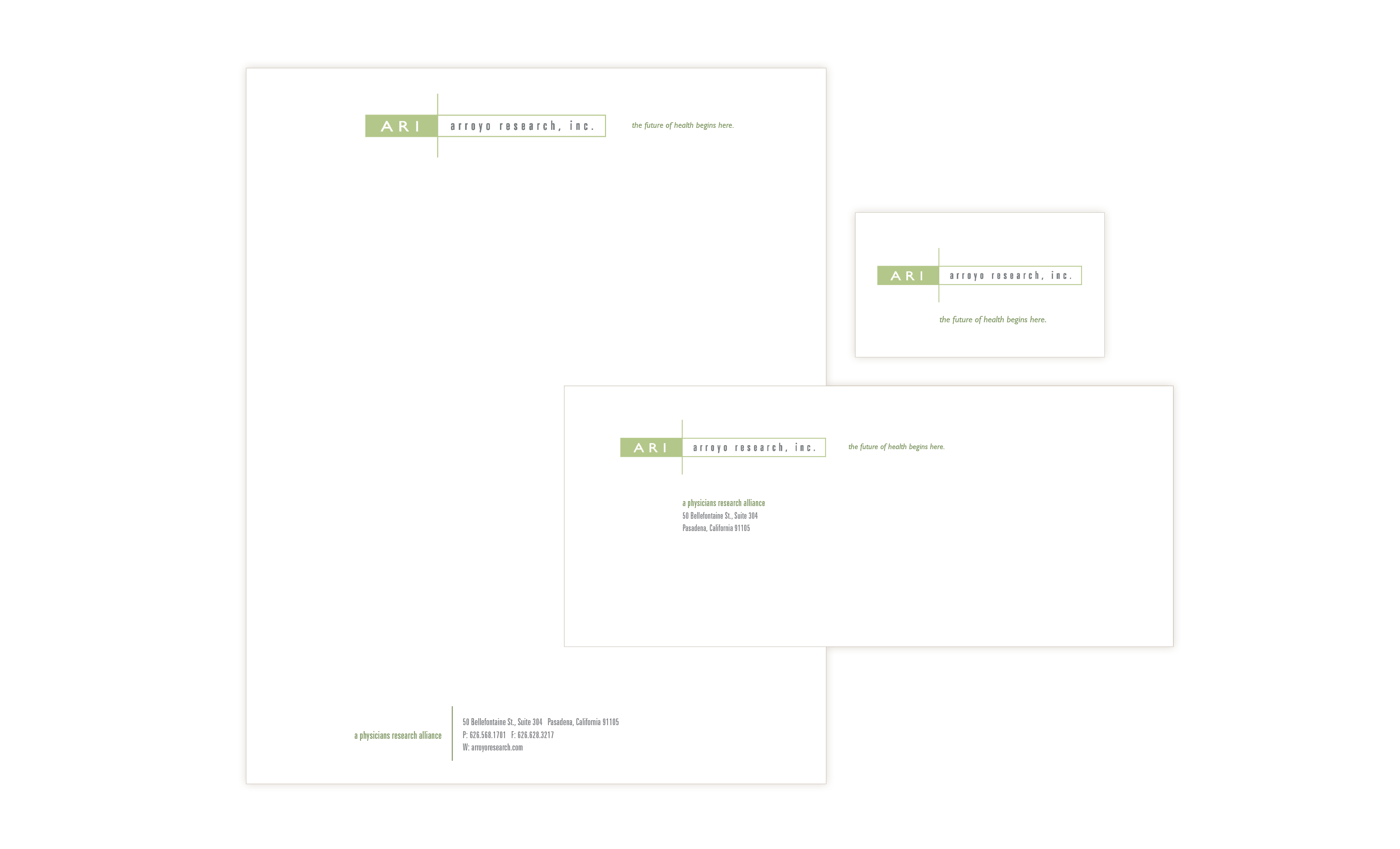
Arroyo Research Inc. Identity
This identity was designed for a physicians research alliance and needed to be precise and technical, but with life (the green) and be appropriate to multiple areas of research.


